|
Statistical Integration
Table of Contents
1. Introduction
The Statistical Integration module provides a progressive analytical framework from individual omics characterization to full multi-omics integration. This tutorial covers the three analytical tiers available for Data Tables input:
- Single-Omics Characterization: Analyze each omics layer individually to identify significant features and patterns
- Pairwise Omics Analysis: Discover relationships between two omics layers through correlation and comparison
- Multi-Omics Integration: Integrate all omics layers simultaneously using advanced methods
2. Single-Omics Characterization
Single-omics analysis examines each omics layer individually to identify features significantly associated with experimental factors and to understand overall patterns within each data type.
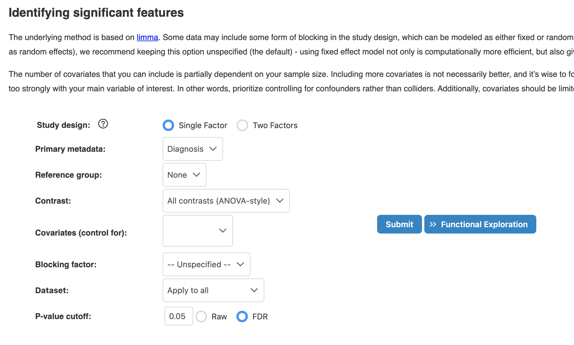
2.1 Significant Features (Limma)
Identify features significantly associated with experimental factors using linear models (limma). This method is widely used for differential expression analysis and provides robust statistical testing.
Key Parameters
- Study Design: Single Factor (one primary variable, recommend) or Two Factors (for interaction effects)
- Primary Metadata: The main experimental factor to test (e.g., Diagnosis, Treatment)
- Covariates: Additional variables to control for confounding effects. Limit to 1-3 for samples < 50
- P-value Type: Use FDR (recommended) for multiple testing correction
Results: Scatter Plot
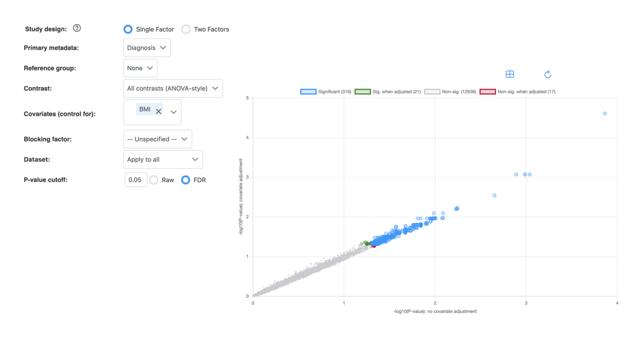
How to interpret:
- X-axis: -log10(P-value) without covariate adjustment
- Y-axis: -log10(P-value) with covariate adjustment
- Blue (Significant): Features significant in both analyses
- Green (Sig. when adjusted): Features that become significant only after covariate adjustment
- Red (Non-sig. when adjusted): Features that lose significance after covariate adjustment
- Gray (Non-sig.): Features not significant in either analysis
Points above the diagonal indicate features with stronger significance after covariate adjustment; points below indicate reduced significance.
2.2 Overall Patterns (Biplot)
Explore sample clustering, grouping patterns, and major sources of variation using biplot visualization. Two methods are available:
- PCA (Principal Component Analysis): Reveals relationships between sample separation and key contributing features
- RDA (Redundancy Analysis): Constrained version of PCA that directly explains patterns based on known experimental factors
Key Parameters
- Method: PCA or RDA
- Color by: Select metadata factor to color-code samples
- Metadata factors: Include covariates for PERMANOVA significance testing
- Number of top features: How many features to display as arrows (1-100)
Results: Biplot
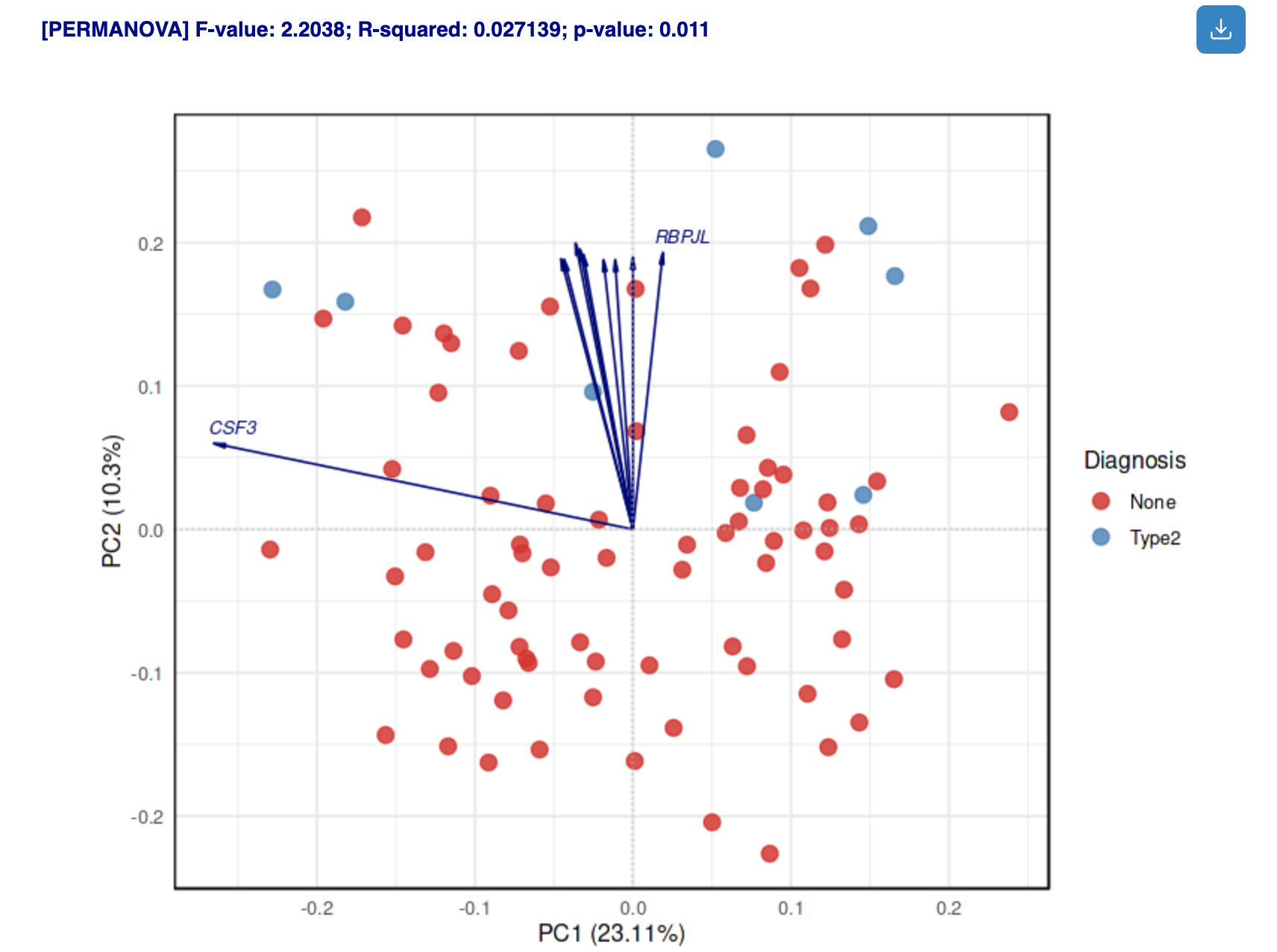
How to interpret:
- Points: Samples colored by selected metadata
- Arrows: Top contributing features; direction indicates correlation with PCs
- PERMANOVA results: Statistical significance of metadata factors (displayed above plot)
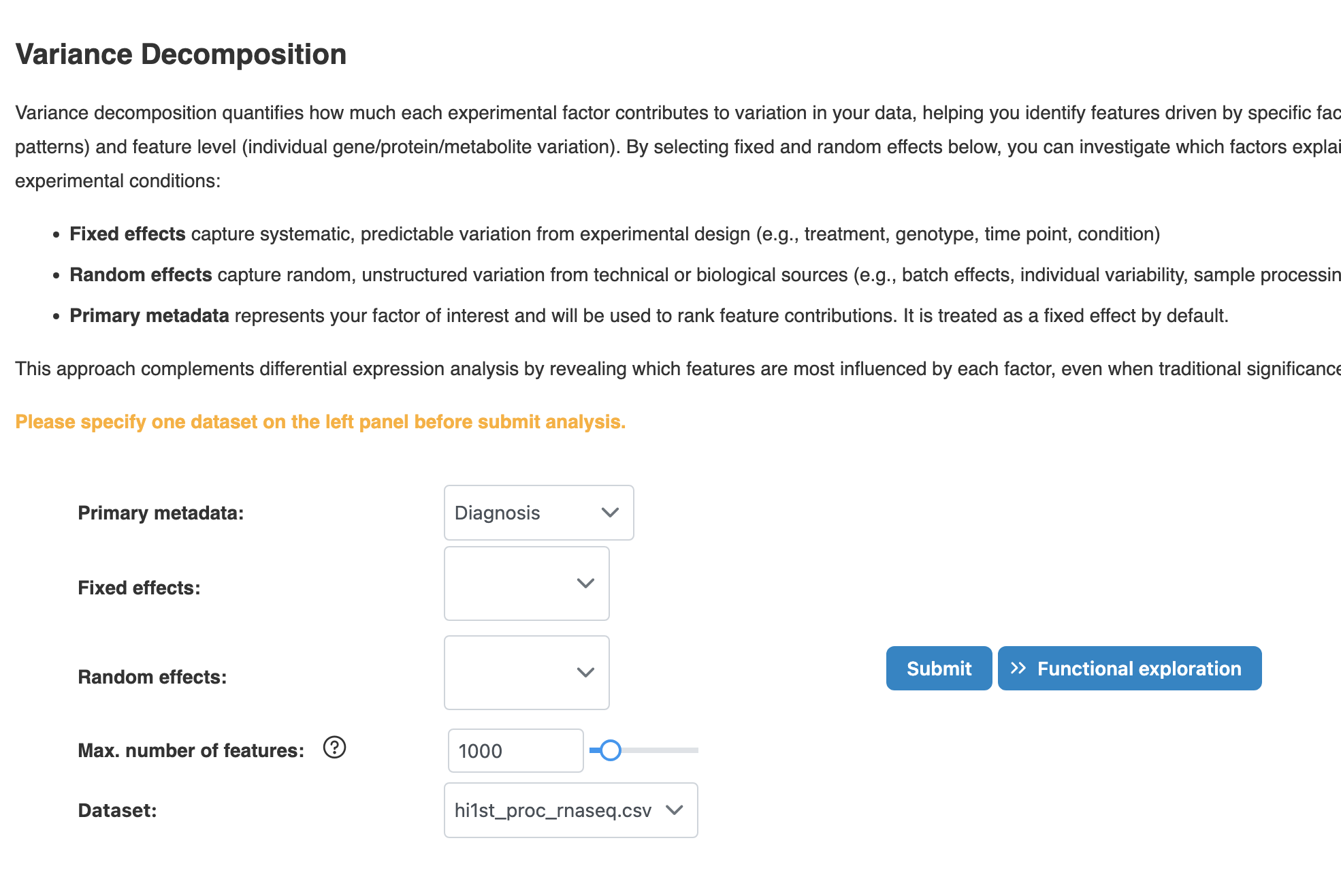
2.3 Variance Partitioning
Decompose global and feature-level variance to quantify how much each experimental factor contributes to variation in your data.
Key Parameters
- Primary metadata: Your factor of interest used to rank feature contributions (treated as fixed effect)
- Fixed effects: Systematic, predictable variation from experimental design (e.g., treatment, genotype, time point)
- Random effects: Random, unstructured variation from technical or biological sources (e.g., batch, individual variability)
- Max. number of features: Limits features included in the model (max 2000 on website for performance). More features increase computation time.
Results: Variance Decomposition
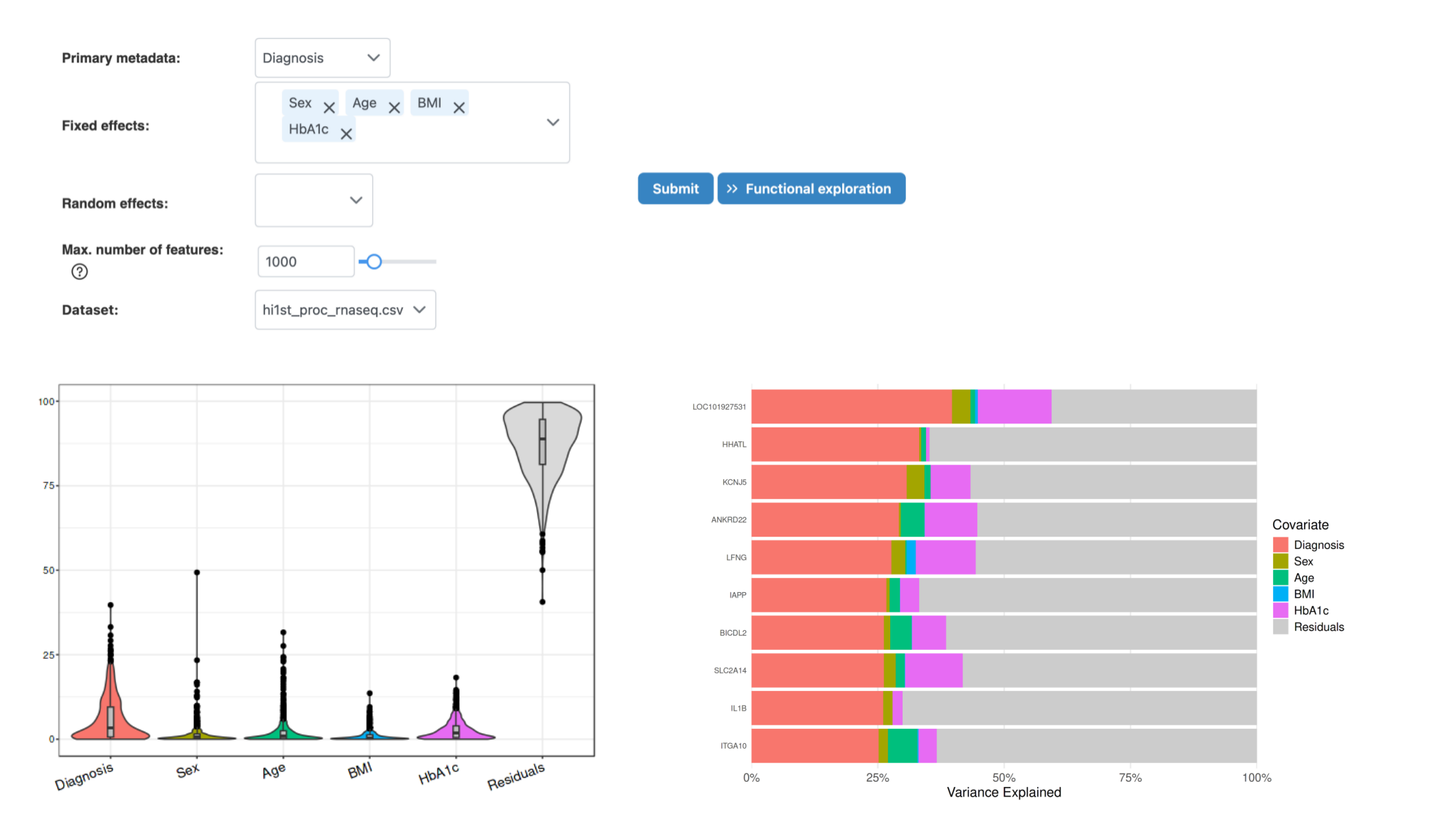
How to interpret:
- Overview tab: Shows percentage of variance explained by each covariate at the global level
- Feature Details tab: Displays top features ranked by variance contribution of primary metadata
- High residual: If residual variance is high, important factors may be missing from the model
3. Pairwise Omics Analysis
Pairwise analysis discovers relationships between two omics layers, revealing cross-omics correlations and potential regulatory connections.
3.1 Clustering Analysis
Clustering analysis helps identify sample subgroups and patterns across multiple omics layers. Several clustering algorithms are available to partition samples into meaningful groups.
Available Clustering Methods
- K-means: Minimizes sum of squared distances between data points and cluster centers. Iteratively assigns points to nearest centroid and recomputes centers until convergence.
- Spectral clustering: Uses eigenvalues of the similarity matrix for dimensionality reduction before clustering. Helps overcome issues with cluster shape and centroid determination.
- SNF (Similarity Network Fusion): Integrates sample similarity matrices from multiple omics datasets by computing similarity matrices individually, then fusing them. Captures both shared and complementary information across data sources.
Key Parameters
- Cluster analysis method: Select K-means, Spectral, or SNF clustering
- Cluster Number: Specify number of clusters (2-10). For perturbation-based clustering, optimal number is determined automatically.
- Datasets: Select which omics datasets to include in clustering
Results: Clustering Analysis
Diagnostic outputs:
- Diagnostic plot: Shows how eigenvalues relate to number of clusters. The optimal cluster number is where the greatest drop in eigenvalue occurs.
- Metadata heatmap: Displays patterns and correlations between metadata variables. Clustering membership is added for comparison against other metadata.
- NMI (Normalized Mutual Information): Indicates clustering performance - higher values suggest better agreement with known sample groupings.
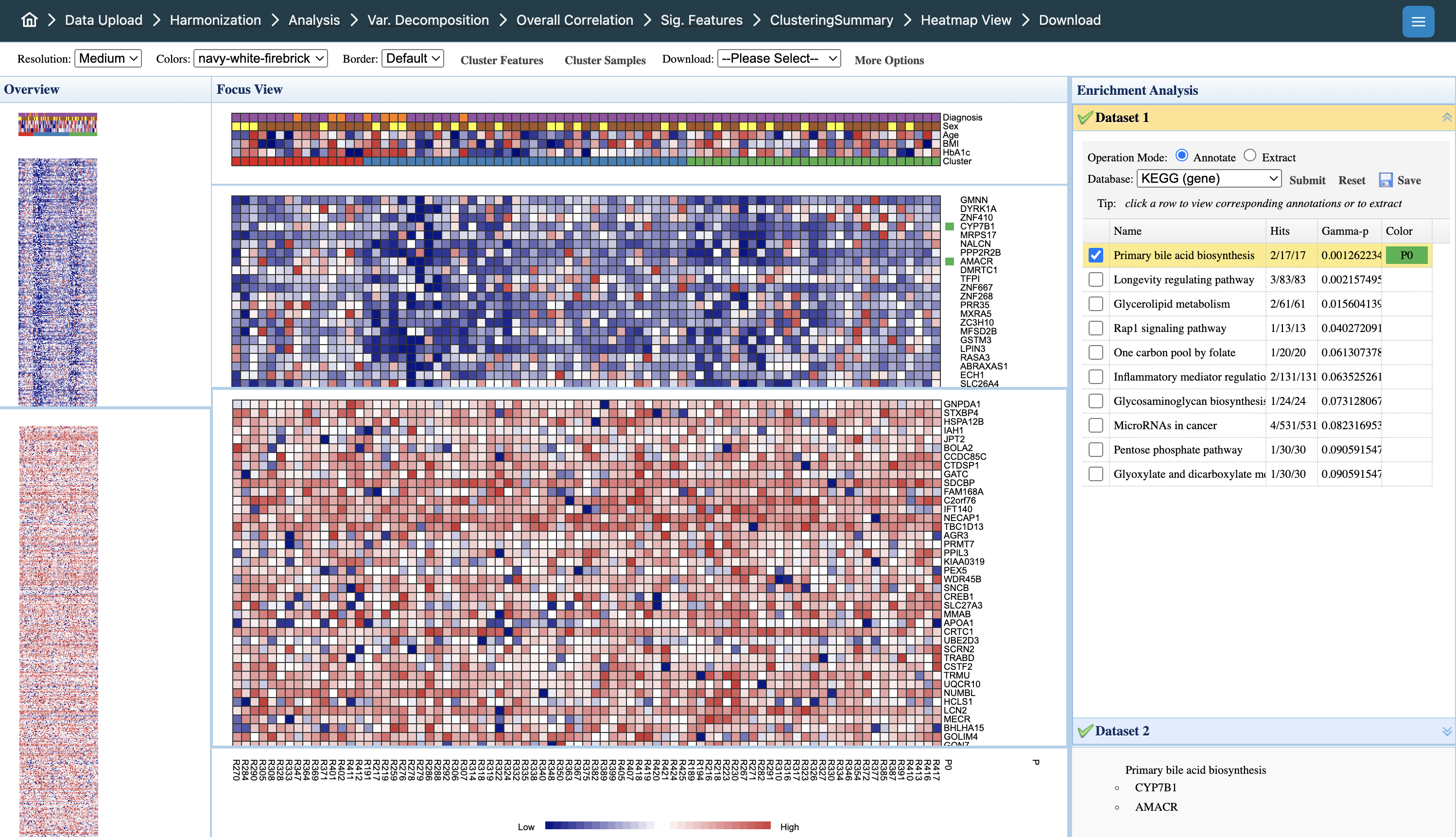
Interpreting the heatmap:
- Overview panel (left): Full dataset view; click to navigate to specific regions
- Focus View (center): Detailed heatmap with samples (columns) and features (rows). Color intensity indicates expression levels (blue = low, red = high)
- Metadata tracks (top): Sample annotations including Diagnosis, Sex, Age, BMI, HbA1c, and Cluster membership for pattern comparison
- Enrichment Analysis (right): Functional annotation of selected features. Click rows to extract pathway members; select pathways to highlight relevant features
- Dataset tabs: Toggle between omics datasets (Dataset 1, Dataset 2) to view layer-specific patterns
3.2 Correlation Network
Network-based visualization of significant feature-to-feature correlations between omics layers.
Key Parameters
- Similarity matrix method: Univariate correlation, Partial correlation, Mutual Information, or IntLIM results
- Between-omics only: When selected, only cross-omics correlations are shown (recommended to avoid within-omics domination)
- Correlation threshold (between-omics): Default is more stringent since within-omics correlations are generally higher
- Correlation threshold (within-omics): Can be set separately if including within-omics edges
- Max. number of edges: Limit edges for visualization performance
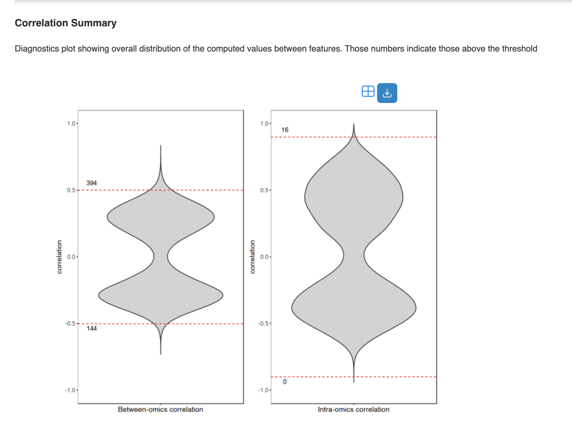
Results: Correlation Network
Diagnostic outputs:
- Correlation Summary: Distribution plot showing correlation values above threshold
- Network Summary: Table with node/edge counts and topology statistics
- Network Filters: Filter by degree, betweenness, or metadata to reduce network size
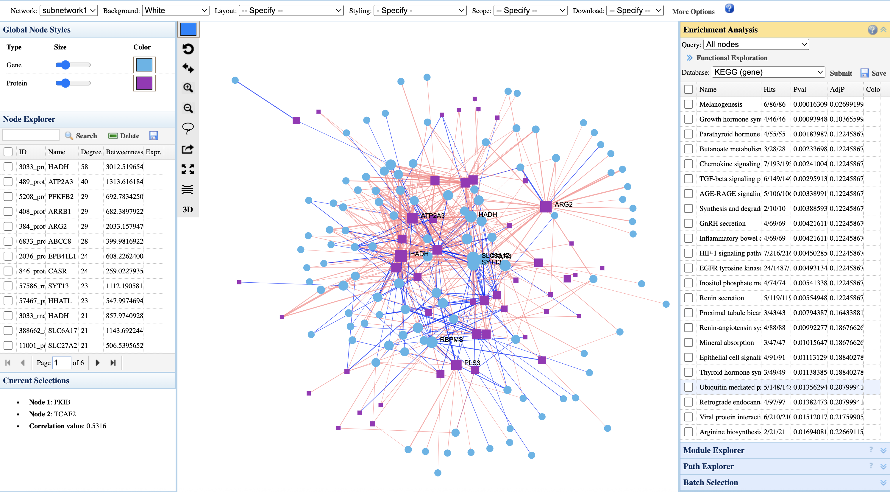
Interpreting the correlation network:
- Node shapes: Different shapes represent different omics types (circles = genes, squares = proteins)
- Node colors: Configurable via Global Node Styles panel; default uses cyan for genes and purple for proteins
- Node size: Larger nodes indicate higher connectivity (degree) or importance in the network
- Edge colors: Red edges = positive correlations; blue edges = negative correlations
- Node Explorer (left): Lists nodes ranked by degree and betweenness centrality; click to highlight in network
- Current Selections: Shows selected node pair and their correlation value
- Enrichment Analysis (right): Functional annotation of network nodes. Select pathways to highlight members in the network
3.3 Differential Chord Diagram
Compare correlation structures between experimental conditions to identify network rewiring events.
Results: Differential Chord Diagram
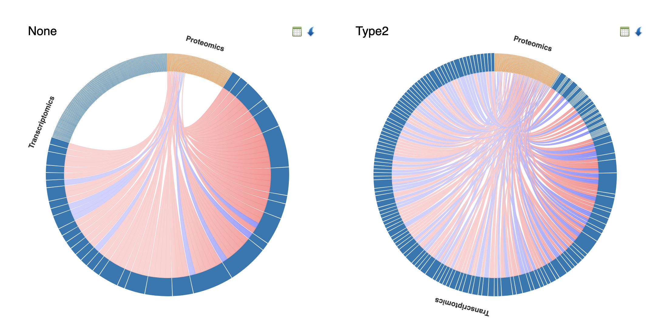
How to interpret:
- Side-by-side comparison: Each diagram represents correlations within a specific condition (e.g., None vs Type2 diabetes)
- Arc segments: Outer arcs represent different omics layers (Transcriptomics in blue, Proteomics in orange)
- Chord thickness: Wider chords indicate stronger correlations between feature pairs
- Chord colors: Pink/red = positive correlations; blue = negative correlations
- Differential patterns: Compare chord density and thickness between conditions to identify network rewiring - features that gain or lose correlations may indicate condition-specific regulatory changes
- Cross-omics focus: Chords connecting different arc segments (e.g., Transcriptomics to Proteomics) highlight cross-omics relationships
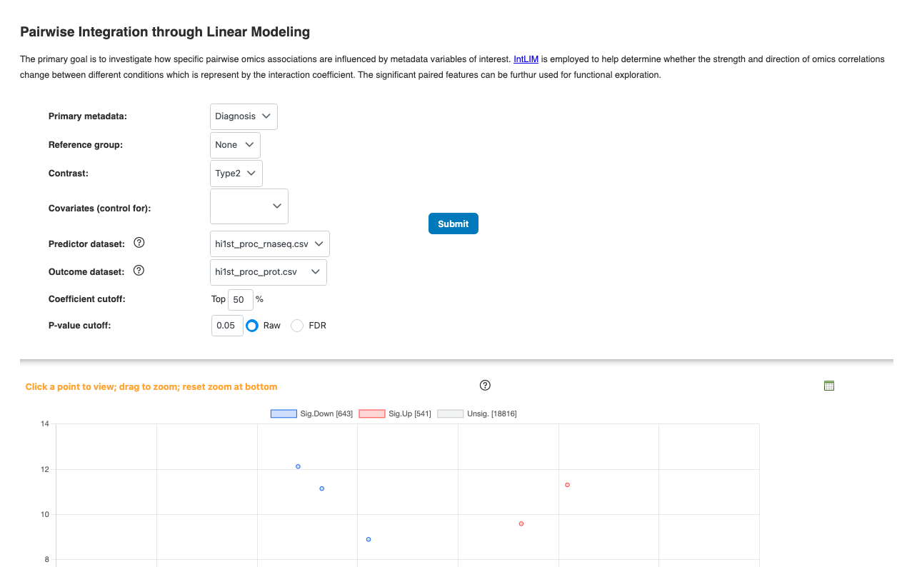
3.4 Causal Analysis (IntLIM & Mediation)
- Pairwise Linear Model (IntLIM): Tests for significant linear relationships between paired features across conditions
- Mediation Analysis: Can be initiated from correlation results or IntLIM results
For detailed explanations, see the Causal Analysis Tutorial.
4. Multi-Omics Integration
Multi-omics integration methods analyze all omics layers simultaneously to identify coordinated patterns and shared biological signals. All methods in this section produce a common set of result visualizations.
4.1 Common Result Outputs
All multi-omics integration methods (Consensus PCA, MCIA, NMF, Semi-NMF, MOFA, DIABLO) produce the same types of result visualizations:
Graphical Summary
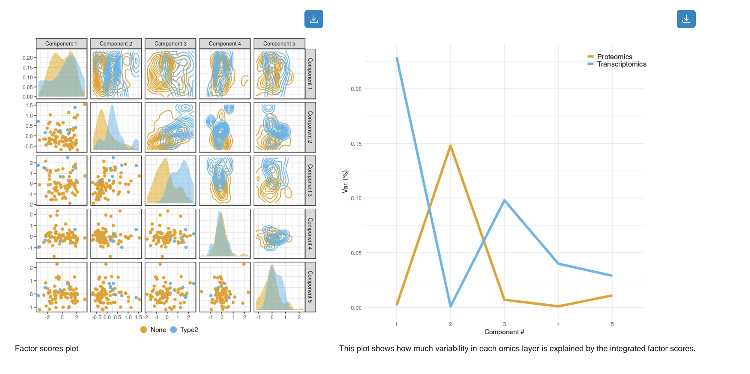
How to interpret:
- Factor Scores Plot (left): Pairwise scatter plots showing sample distributions across components. Diagonal shows density distributions; off-diagonal shows scatter plots colored by experimental groups (e.g., None vs Type2)
- Variance Explained Plot (right): Line plot showing how much variability in each omics layer is explained by the integrated factor scores. Different colors represent different omics types (e.g., Proteomics in orange, Transcriptomics in blue)
Variance Explained Table
The table summarizes the variances captured by the top components in each omics layer. Click the Browse button to view detailed loading contributions of each feature.
- File Name: Source data file for each omics layer
- Omics Type: Classification of the data (Transcriptomics, Proteomics, etc.)
- Variance Captured: Percentage of variance explained by each of the top 3 components
3D Scatter Plot
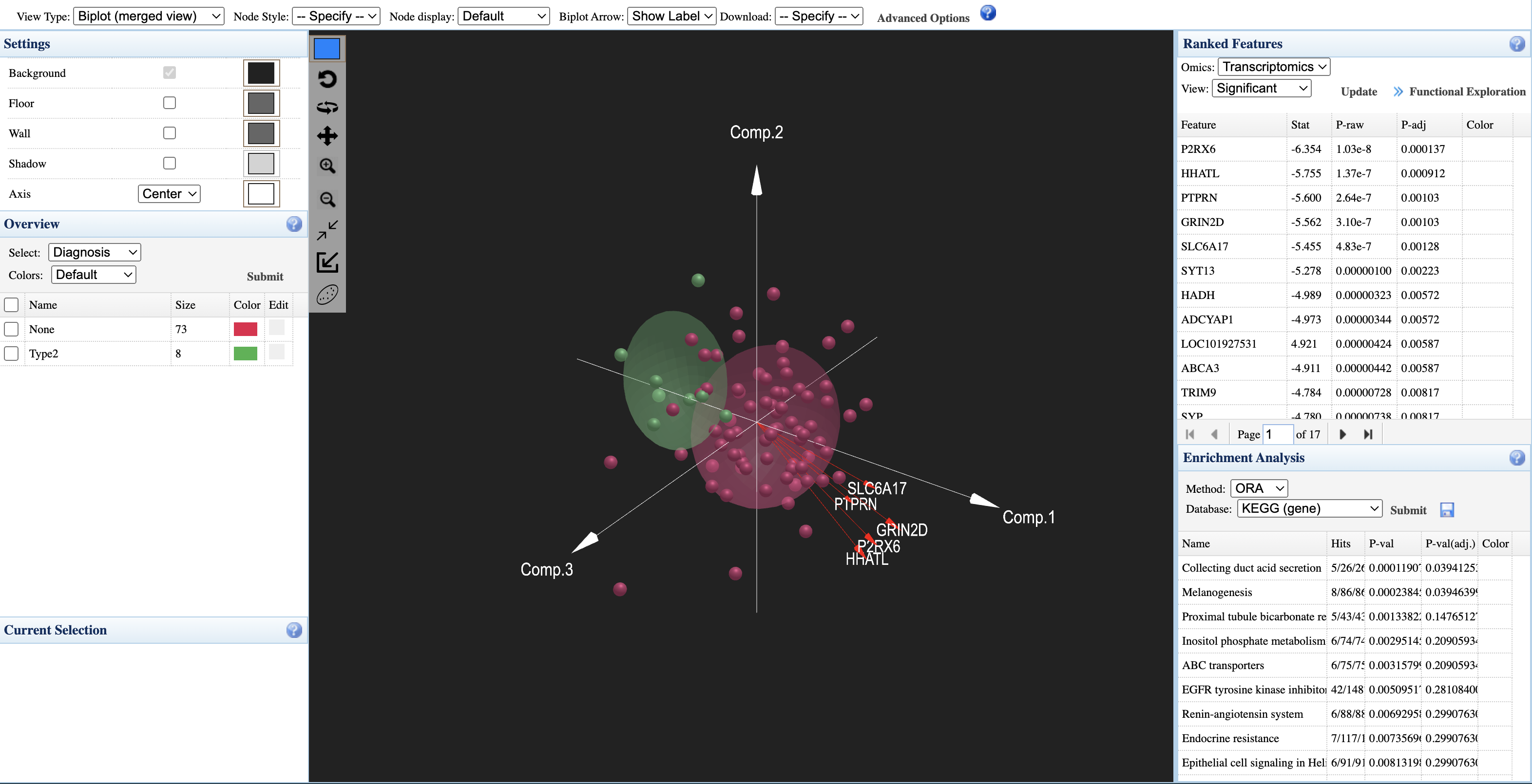
How to interpret:
- Sample points: Each point represents a sample, colored by experimental group (e.g., red = None, green = Type2)
- Axes: Three principal components (Comp.1, Comp.2, Comp.3) showing integrated variation
- Group ellipsoids: Confidence ellipsoids showing the distribution of each group in 3D space
- Overview panel (left): Select metadata variable to color samples; view group sizes
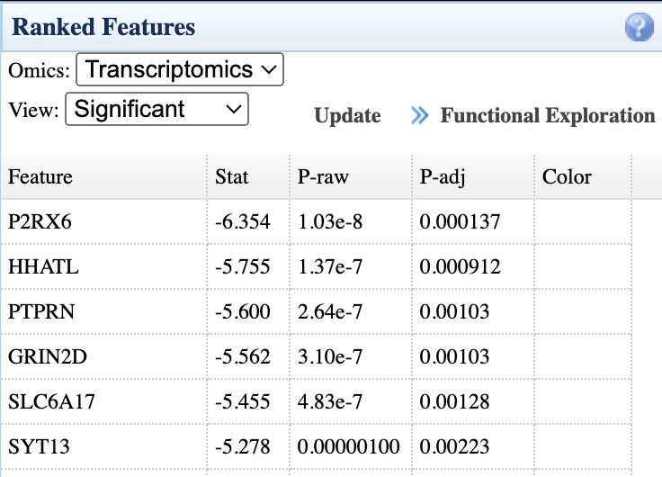
- Ranked Features panel (right): Lists significant features from each omics layer with statistics; click "Functional Exploration" to proceed to pathway analysis
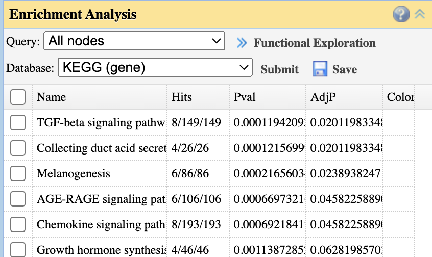
- Enrichment Analysis: Perform ORA analysis on ranked features using KEGG or other databases
4.2 Global Exploration Methods
Consensus PCA
Rapid, global summary of common trends shared across multiple datasets. Useful for initial exploration and visualizing overall multi-omics patterns.
Multiple Co-inertia Analysis (MCIA)
Visualizes global agreement (concordance) between multiple datasets. Projects all omics layers onto a common space while preserving each layer's structure.
4.3 Latent Factor Discovery
Fast NMF / Semi-NMF
Fast NMF: Discovers biologically interpretable, "parts-based" patterns (like distinct pathways) shared across datasets. Requires non-negative data.
Semi-NMF: Similar to Fast NMF but allows negative input values without pre-transformation, preserving biological meaning.
MOFA (Multi-Omics Factor Analysis)
Best for disentangling sources of variation in multi-omics data. MOFA identifies latent factors that can be shared across omics layers or unique to specific layers.
Interpretation tip: In the variance explained plot, uneven bars across omics types indicate layer-specific factors; even bars indicate shared factors.
4.4 Feature Selection & Biomarker Discovery
DIABLO
Supervised method for finding features that are both discriminative (separate groups) and correlated across omics layers. Best for biomarker discovery and classification.
Key parameter: Design matrix controls the balance between discrimination and cross-omics correlation.
4.5 Choosing the Right Method
| Method | Supervision | Best Use Case | Requirements |
|---|---|---|---|
| Consensus PCA | Unsupervised | Initial exploration, quick overview | ≥10 samples; no feature limit |
| MCIA | Unsupervised | Visualizing agreement between layers | ≥10 samples; no feature limit |
| NMF/Semi-NMF | Unsupervised | Parts-based pattern discovery | ≥15 samples |
| MOFA | Unsupervised | Variance decomposition, factor interpretation | ≥15 samples; handles missing values |
| DIABLO | Supervised | Classification, biomarker selection | ≥20-30 samples per group; balanced groups recommended |
5. Interpreting Results
5.1 Understanding Your Results
Statistical Integration provides three levels of analysis, each answering different biological questions:
What features matter in each omics layer?
Single-Omics Characterization (Limma, Biplot, Variance Partitioning) identifies significant features and major variation sources within individual omics datasets. Look for FDR < 0.05 and meaningful effect sizes.
How do features relate across omics layers?
Pairwise Analysis (Clustering, Correlation Network, Chord Diagram, IntLIM) discovers cross-omics relationships and sample subgroups. Focus on hub nodes in networks and condition-specific correlation changes.
What integrated patterns exist across all layers?
Multi-Omics Integration (Consensus PCA, MCIA, NMF, MOFA, DIABLO) finds coordinated signals across all omics simultaneously. Check variance explained plots to understand which layers drive each factor.
- Statistical significance: Use FDR-adjusted p-values < 0.05
- Biological relevance: Consider effect sizes, not just p-values
- Validation: For supervised methods (DIABLO), check cross-validation accuracy > 0.7
- Context: Use enrichment analysis to interpret feature lists biologically
5.2 Recommended Analysis Workflows
For comprehensive multi-omics analysis, we recommend the following analysis combinations based on your research goals:
Discovery-Focused Workflow (Unsupervised)
Best for exploratory analysis when you want to discover patterns without prior hypotheses:
- Start: Limma + Variance Partitioning → understand each omics layer individually
- Explore: MOFA or Consensus PCA → identify shared and unique variation sources
- Connect: Correlation Network → discover cross-omics feature relationships
- Interpret: Functional Exploration → pathway enrichment for biological context
Biomarker Discovery Workflow (Supervised)
Best when you have defined groups and want to find discriminative signatures:
- Start: Limma → identify significant features per omics layer
- Integrate: DIABLO → find multi-omics discriminative signatures
- Validate: Check cross-validation performance (aim for balanced accuracy > 0.7)
- Interpret: Examine selected features and their cross-omics correlations
Mechanistic Investigation Workflow
Best when you want to understand regulatory relationships and causality:
- Start: Correlation Network or IntLIM → identify feature pairs of interest
- Investigate: Chord Diagram → compare correlations between conditions
- Test: Mediation Analysis → test causal hypotheses for selected pairs
- Validate: Network Integration → place findings in pathway context
- Always start with single-omics QC and characterization before integration
- Use FDR-adjusted p-values (< 0.05) and consider biological effect sizes
- For supervised methods, ensure adequate sample size (≥20-30 per group) and check for overfitting
- Validate key findings using multiple complementary methods
- Use enrichment analysis to place statistical findings in biological context
6. Next Steps
Direct to Network Integration
Use the "Functional Exploration" button to send significant features directly to Network Integration for pathway analysis.
Step 1: Click "Functional Exploration" from any of these panels:
Step 2: Confirm and proceed:
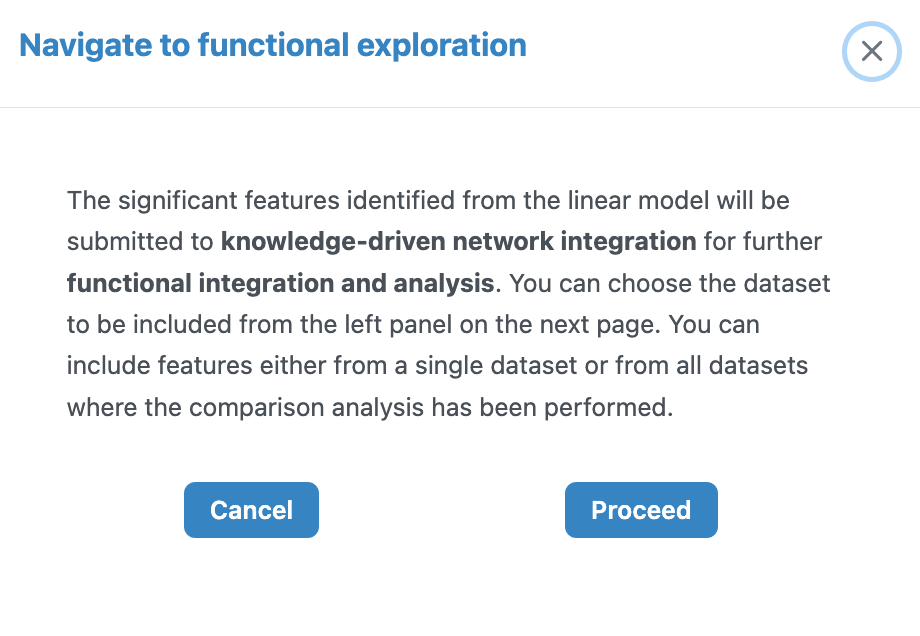
See the Network Integration Tutorial for detailed guidance.
Direct to Causal Analysis
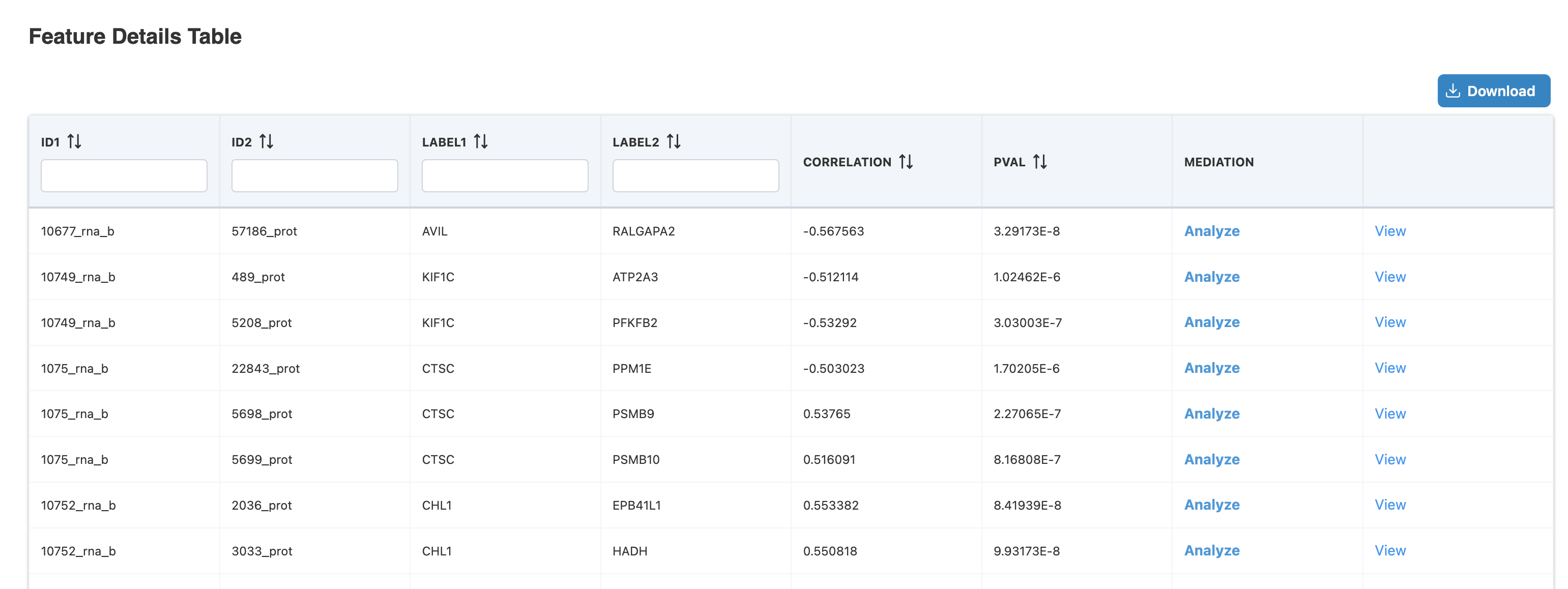
From Correlation Network or IntLIM results, proceed to Mediation Analysis to test mechanistic hypotheses.
Step 1: Click the table button from either source:
Step 2: Click "Analyze" in Feature Details Table:
See the Causal Analysis Tutorial for detailed guidance.
